
Homely.
Homely is a grocery store situated in the suburbs of an Indian city. It is a family run grocery store that has been catering to the daily needs of the residents of the neighbourhood. Homely offers a wide variety of grocery items from popular brands to their in house homemade products. Through the process of researching, branding and testing, I created a mobile app that would meet the goals of Homely and their customers.
*Note: This project is based on a fictional store.
Project Overview
CHALLENGE
Creating Homely app to provide their customers a comfort of shopping from home to reduce the time spent in their cozy store looking for items and in queue. This way they don't have to worry about handling the crowd during peak times.
SOLUTION
For this project, I will be working on creating a new brand identity for Homely and building an online shopping experience that addresses their users’ needs.
ROLE
UX, UI Designer
April 2022, 4 weeks
DURATION
Kickoff
To start off, I asked myself some generic but useful initial questions. These questions helped me take the best steps possible to t to understand Homley's users. Qualitative research methods proved to be the most effective during our design process, most notably user interviews and usability testing sessions.
DISCOVER
Research
Through user interviews, competitive analysis, and other secondary research, I set out gain a deeper understanding of the market and Homely’s customers.
Research Goals
Before diving into my research, I created a research plan to define my research goals to help me conduct the research with clear direction and purpose.
-
Identify the primary users of Homely
-
Identify which users are the most important to the business
-
Discover the goals, needs, motivations, and frustrations of Homely’s users
-
Understand what users need the most in a product like this
-
Identify Homely’s competitors and evaluate their strengths and weaknesses
User Interviews
While I had an understanding of Homely's market and the general audience in the neighbourhood, I wanted to learn more about who the primary users are and what have their experiences been like while shopping at Homely. I conducted interviews of five residents of varied background to understand the problems they encounter and/or overlook when they have to shop at Homely. The interview was conducted in two phases: first to understand the user and what he/she has to say about grocery shopping in general; second to understand their experience with Homely.
After conducting these one-on-one sessions with the participants, I wanted to take all this new information gained and synthesize it to better understand who the users are. It was now time to do a deeper analysis by using an empathy map.
Empathy Map
Using an empathy map, I synthesized all the information I gathered during the user interviews to uncover key insights that led to identifying Homely's target user group. I categorised my notes into what the user Sees, Says and Does, Thinks and Feels, and Hears. Following this I identified the Pains and Gains related to the grocery shopping experience at Homely's store.
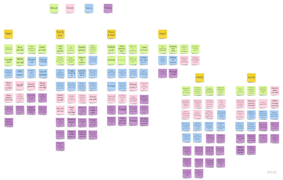
This helped me to uncover common patterns that helped me identify the pain points of the users.
-
Users are too busy to shop for groceries and explore their options.
-
The experience of shopping at the crowded store is tiring and inconvenient.
-
Communication and sharing of the responsibility with family is affected due to the store working hours and environment.
-
Keeping track of grocery needs is a tedious process and some items are forgotten while shopping at the store.
User Personas
Two personas are created to better represent the needs and frustrations of the users after grouping the users interviewed into two categories. Meet Immanuel and Neelam. The primary user group identified are working adults who don't have the time to explore and shop for groceries.

User Journey Map

Competitive Analysis
I wanted to take a closer look at Homely’s competitors and how they’re helping their users shop for groceries. Through my market research, I identified some top direct and indirect competitors: Bigbasket, JioMart and Swiggy Instamart. Direct competitors are grocery-focused companies similar to Homely, while indirect competitors aren’t focused solely on groceries. Exploring each of their apps, I evaluated the strengths and weaknesses of each to see how Homely could fill in any gaps moving forward.
.png)
DEFINE
Defining the problem
Now that I have a better understanding of Immanuel, Homely's user, it is important to understand the problem I was trying to solve for her. Using the insights and needs from the empathy map, I began to probe further to learn more about Immanuel's problem. I used the 5W1H questions to define the problem and frame the problem statement. Based on the problem statement I used the method of "How Tos" to think of ways to solve the problem which helped me create a goal statement for the project.
.png)
Goal Statement
The Homely app will let users explore and shop for groceries anytime and from anywhere, which will affect busy working adults who find in-store shopping stressful by reducing in-store confusion and saving them from compromising their leisure time.
Brainstorming
After understanding the problem I had to design for and establishing the goal statement for the project I started the brainstorming process to come up with features for the app that will address the problem. I categorised the features and then selected the most important features to include in the app.
.png)
Information Architecture
Application Map
To begin designing the application's architecture and where the features would go into it, I constructed an application map to organise the screens in a logical and intuitive manner for the user.
.jpg)
User Flow
I created a user flow chart to understand the path taken by Immanuel on the homely app to complete the ordering task. The User Task is to use Homely app to explore and shop for groceries.
.jpg)
DEVELOP
Wireframing
P & P Wireframes
Working through a few very basic designs, I discovered that some of the features and layouts just wouldn't work. I used a timer and created 3-5 wireframes for each screen. I was not only able to rapidly probe some of the concepts I was having difficulty understanding, but I was also able to take them and stimulate further sketching as well as swiftly filter out the good and poor features.

Mid Fidelity Wireframes
I wanted to make sure the design was user friendly before focusing on the visual aspect. To do this, I decided to create a mid-fidelity prototype that would enable me to quickly test the design with actual users and make any necessary corrections before incorporating the branding and visual design. I started by creating mid-fidelity wireframes of the main screens that users would interact with on Figma before starting to build the prototype.

Home Screen

Product Categories


Search Results
Category Results


Order Preview

Checkout Screen

Order Confirmation Screen
Product Details
.png)
Mid Fidelity Prototype
Using the wireframes, I worked to produce a mid-fidelity, minimally functional prototype using Figma for usability testing.
.png)
.png)
.png)
Usability Testing
To assess how easy it is for users to complete the task of exploring and placing an order on the Homely app prototype , I conducted a remote, moderated Think Aloud testing over Zoom. The users were asked to share what they were doing, thinking, and feeling while interacting with the prototype and trying to complete the tasks given to them. I tested the key tasks: browse a general category, find a specific item, find another item and view the details, add it to the cart and complete the order.
-
Method: Remote, moderated usability testing (Think Aloud)
-
Participants: 3
-
Age range: 30 - 40
-
Average Time: 4.4 minutes
Overall, the testing showed positive results, but there were some areas in which users faced slight difficulties.
Affinity Map
I compiled all of my notes and observations into an affinity map to summarise the results of my testing. This made it easier for me to process the many patterns I noticed while testing and to identify which revisions should be given priority in order to enhance the usability of the design. Based on the patterns observed related to the users’ pain points, I was able to uncover insights which helped in recommendations for the revisions.

PAIN POINTS
-
2/3 participants had trouble going through a huge list of categories.
-
3/3 participants hoped for fresh stock information at more places.
-
3/3 participants were confused with the functions of favourites feature and list feature.
-
3/ 3 participants saw a use for purchasing certain items regularly through the app.
-
2/3 participants were looking to be informed about when the order is ready to be picked up.
-
2/3 participants thought the add to cart button would change to go to cart after an item was added to the cart.
.png)
Priority Revisions
1. Change the categories to more specific categories by including nested categories.
.png)
Before
.png)
After
2. Add labels to each feature to clearly describe its functions.
.png)
Before
.png)
After
3. Display information of the order status on the Home screen.
.png)
Before
.png)
After
DELIVER
Style Guide
After making the revisions to improve usability, I worked on finalizing Homely’s visual identity and created a style tile. Homely’s branding reflects the attributes: Inviting, Friendly, Fresh, and Grounded. I worked on setting the visual direction of their branding to convey their unique identity. Using colors that reflect these attributes helped convey their feeling. Shades of green, orange and pink represent these attributes well and hence they are used. The main typeface of choice for the app is Open Sans and it is paired with the serif typeface Playfair Display.

UI Kit
I incorporated Homely's branding into the UI components used for Homely's application using the style tile as a reference. I made a UI kit to document them reference to ensure the design standards remain consistent.

Final Prototype
Finally I on producing final, high resolution wireframes using my revised wireframes and produced a finished prototype. The style tile helped me incorporate their branding into the visual elements of the application.

Reflection
Secondary and primary research were critical in coming up to speed with the market and empathizing with other people's experiences. Overall, it was a lot of fun to work on this project since I got to design an app from start to finish. Since I was not able to completely flesh out additional features and designs I wanted to, I will try to integrate them in the future.